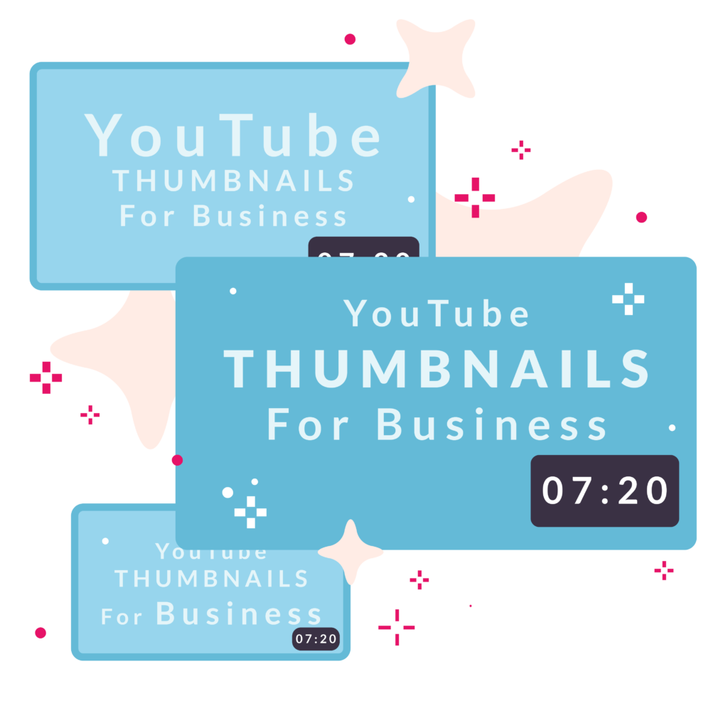
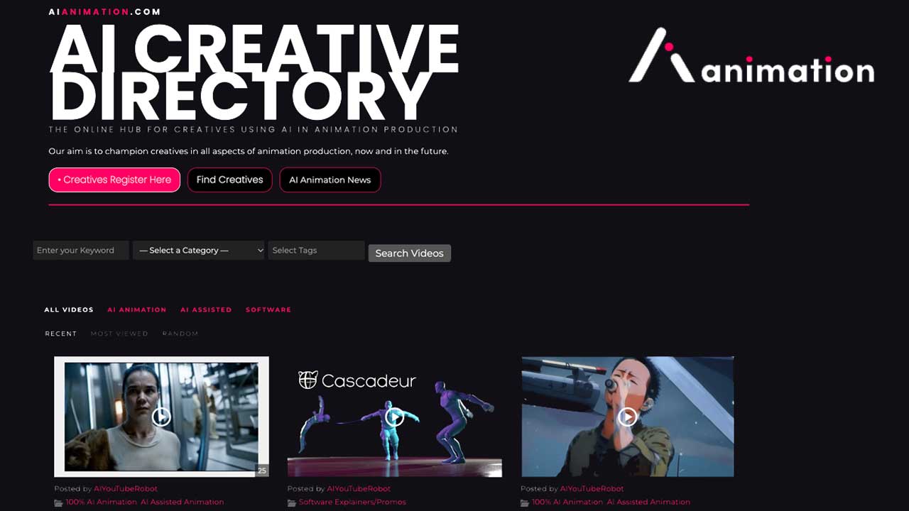
YouTube Thumbnails for business

You’ve decided to advertise your business on YouTube. How do you make sure your thumbnails stand out?


A thumbnail is the first thing potential viewers will see: a small, still image which catches their attention, tells them what the video is going to be about and makes them curious to know more. According to YouTube, 90% of the best performing videos have custom thumbnails. This article breaks down the things you should bear in mind when creating thumbnails for your content.

1. Make sure you're up to size


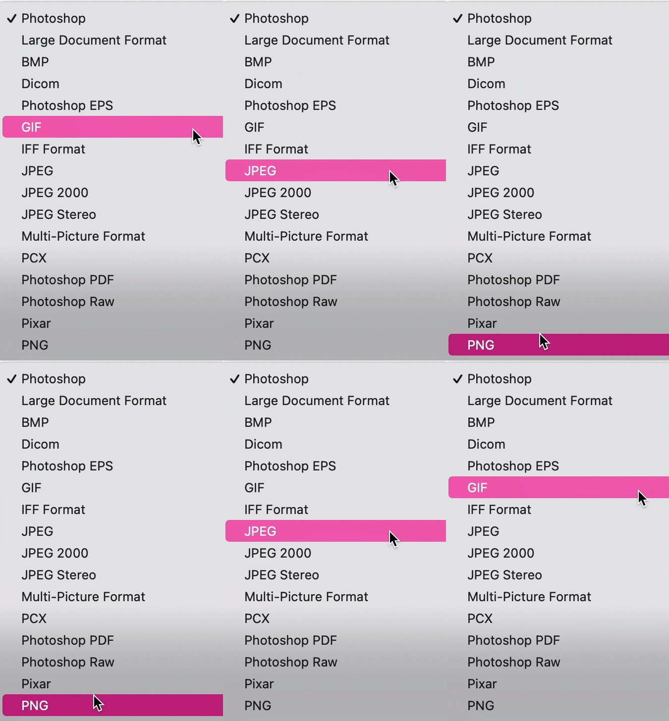
Saving formats gif animation

According to YouTube’s guidelines, an ideal thumbnail should have a resolution of 1280 x 720 PPI, with a minimum width of 640 pixels, while remaining under 2MB for a successful upload. Save your thumbnail images in formats such as JPG, GIF, or PNG and try to use a 16:9 aspect ratio. Remember that thumbnails are viewed as a small image, so make the most of the space you have available and aim to make your thumbnail as high-definition as possible.


Thumbnail dimension sizing image

1. Make sure you're up to size


According to YouTube’s guidelines, an ideal thumbnail should have a resolution of 1280 x 720 PPI, with a minimum width of 640 pixels, while remaining under 2MB for a successful upload. Save your thumbnail images in formats such as JPG, GIF, or PNG and try to use a 16:9 aspect ratio. Remember that thumbnails are viewed as a small image, so make the most of the space you have available and aim to make your thumbnail as high-definition as possible.


Image
Saving formats gif animation

2. Be attention-seeking


A good-looking thumbnail can often make the difference between a view and a scroll-on-by, so designing something that stands out is essential. Here are our top tips:


YT Thumbnail text overlays image

Text Overlays


If you want your thumbnail to communicate effectively with your audience, including text can help. Derral Ives, a YouTube and Video marketing consultant, recommends including text overlays in your thumbnail whenever you’re aiming to explain something, whether it’s advertising a new product or describing your business to future clients.


Think carefully about where to place your text on your thumbnail, and which key words you should emphasise. Consider how the text will appear on different devices and ensure it won’t be obscured by the thumbnail’s timestamp, or any other notifications that might appear.


Finally, be consistent with the fonts you choose. Make sure the fonts you use are clear and easy to read even when viewing the thumbnail on the small screen of a mobile. Pick an attractive font and stick to it in your videos to build brand consistency on your channel.

Image

Contrast


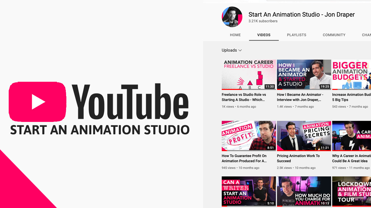
A clear colour palette which utilises contrast is another effective way for your thumbnail to grab attention. In the same way as fonts, it’s best to be consistent about the colours you use to build up a ‘look’ for your video marketing content.

When creating your thumbnail, you can create contrast both in the photos you choose to use, and through enhancing graphics. Using a coloured background behind fonts, for example, is a great way to build visual interest in your thumbnail using contrast.

YT Thumbnails contrasts and colour palettes image

Contrast


A clear colour palette which utilises contrast is another effective way for your thumbnail to grab attention. In the same way as fonts, it’s best to be consistent about the colours you use to build up a ‘look’ for your video marketing content.

When creating your thumbnail, you can create contrast both in the photos you choose to use, and through enhancing graphics. Using a coloured background behind fonts, for example, is a great way to build visual interest in your thumbnail using contrast.

Image

Youtube thumbnails creating connections image

Create connections


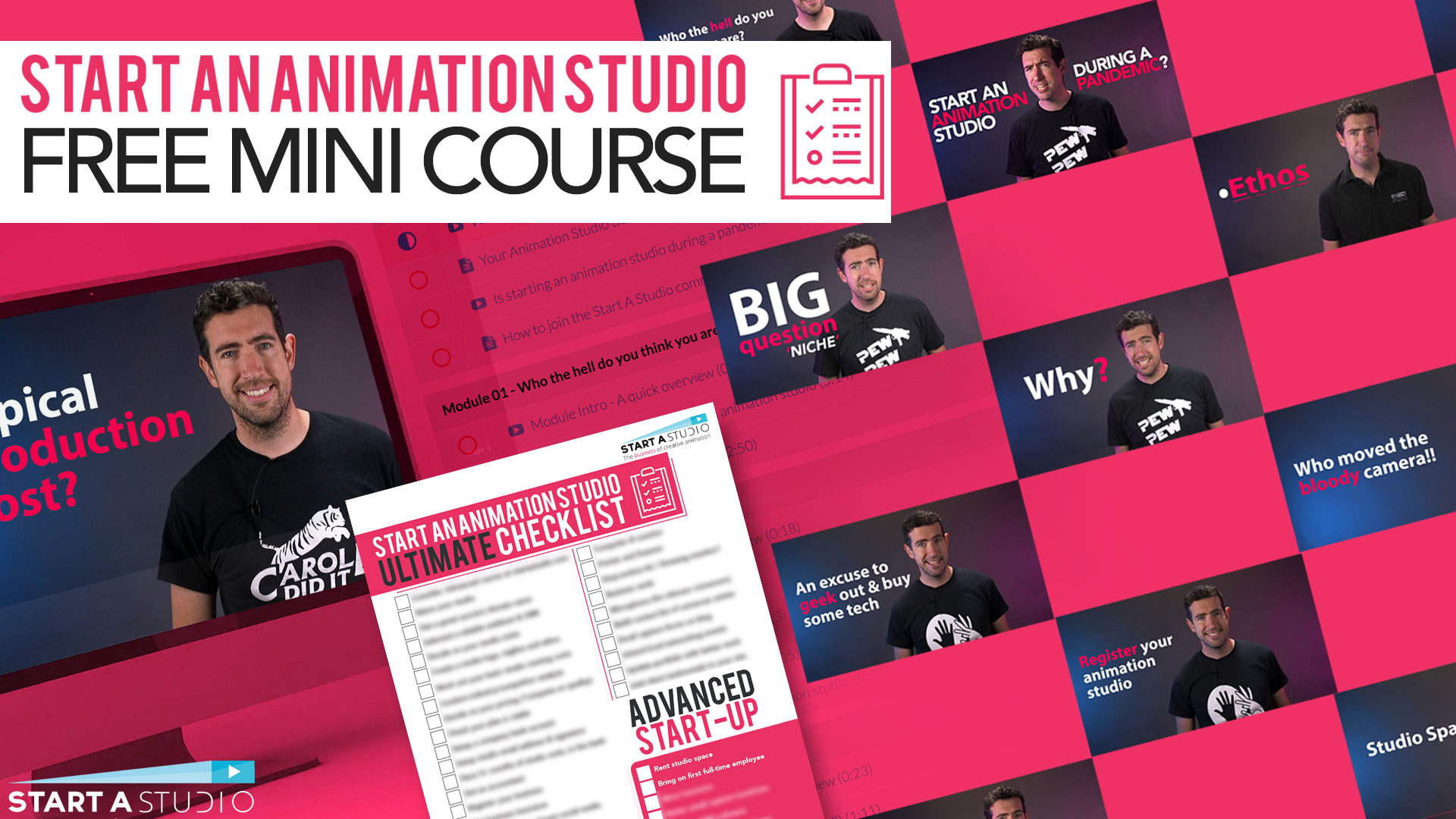
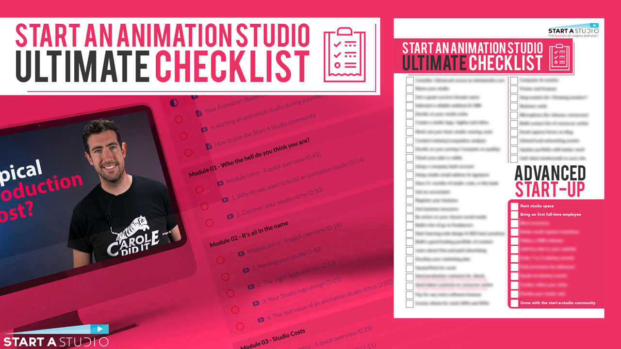
Thumbnails can not only help you create a consistent brand image, but also create visual links between the content you upload. Do you have a series of videos you’ve been working on, or a group of videos which all relate to the same topic? Create a ‘look’ for each video, considering your brand visuals, to visually connect them in the viewer’s mind. Check out how we grouped together videos relating to our award-winning Start a Studio Course using thumbnail formatting:

Image

Use the rule of thirds


The rule of thirds is a visual design trick that will make your thumbnails more appealing. If you imagine your image is separated into nine equal parts, placing visually interesting points of your image with an intersecting point on the imaginary ‘grid’ will create the maximum visual appeal. Make sure your thumbnail isn’t too crowded—not every point needs to match with a visual detail. Fill at least two-thirds of your thumbnail with the main subject for effective impact.

Youtube thumbnails rule of thirds image

Use the rule of thirds


The rule of thirds is a visual design trick that will make your thumbnails more appealing. If you imagine your image is separated into nine equal parts, placing visually interesting points of your image with an intersecting point on the imaginary ‘grid’ will create the maximum visual appeal. Make sure your thumbnail isn’t too crowded—not every point needs to match with a visual detail. Fill at least two-thirds of your thumbnail with the main subject for effective impact.

Image

Incorporate graphics


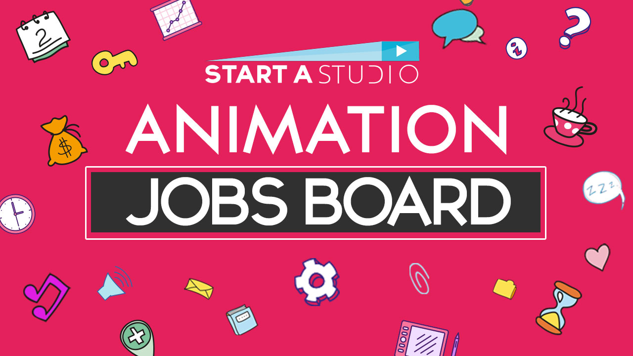
Make a photograph more visually appealing by incorporating graphics. These can be another great way to incorporate an eye-catching colour palette into your videos. Consider adding graphics to the main video as well as the thumbnail, using them to punctuate your video’s key points and create a dynamic flow. Check out one of our videos to see how we incorporate graphics into our videos.

3. Spark Curiosity


Sparking curiousity through your YouTube thumbnails - girl on a computer image

Your thumbnail should prompt your viewer to want to know more, so create an image that sparks their curiosity. Including a question in the thumbnail, overlayed in text, is one way you can prompt your viewer to click on your thumbnail.


Make sure not to overdo this tip, and steer clear from ‘clickbaity’ videos, whose thumbnails will often promise more than they can deliver. Ideally, your thumbnail should offer viewers a ‘sneak peek’ of the content they’re about to watch, enough to pique their interest without exaggerating.

Image

4. Deliver your promise


Always remember that a thumbnail is not a standalone image — it works alongside the content of your video. Make sure your thumbnail design is informed by the content you’re providing. Watching the video through after clicking on the thumbnail can be a helpful way to check that the visual impact of the thumbnail is realised in the content of the video. Creating a great-looking thumbnail that links to a boring or unrelated video is a sure-fire way to make viewers loose interest in your content.


For more tips on creating YouTube content, check out our blogpost here.

5. Experiment with design


Although the tips offered in this article are a good place to start when designing a YouTube thumbnail, the best way to find what works for your business marketing strategy is through experimentation. Try different designs when uploading videos and see which elements bring the most views to your content. Having a consistent and frequent upload schedule will give you a good range on analytics to study and improve from.

Experimenting with design for your Youtube Thumbnails image

Although the tips offered in this article are a good place to start when designing a YouTube thumbnail, the best way to find what works for your business marketing strategy is through experimentation. Try different designs when uploading videos and see which elements bring the most views to your content. Having a consistent and frequent upload schedule will give you a good range on analytics to study and improve from.

Experimenting with design for YouTube thumbnails image

6. Appeal to advertisers

It may sound obvious, but make sure your videos observe YouTube’s advertiser friendly content guidelines. Breaking these rules will not only result in a loss in ad-revenue, but will mean that your video is much less likely to be promoted by YouTube’s algorithm. Double and triple-check your content for anything which might fall under these guidelines, even if it’s being used in a comedic or ironic way.

Uploading your custom thumbnail


Uploading your custom thumbnail

When you upload a new video to your channel, you’ll see a selection of automatically generated thumbnails. Ignore them and click on the ‘upload thumbnail’ button instead. Select your image, and watch your views go up!

Image

Image

Changing a pre-existing thumbnail

If you want to change the thumbnail of an existing video, you’ll need to upload your new thumbnail to your YouTube channel. To do this, sign into your YouTube Studio account, and select ‘Content’ from the left-hand menu. To select a video, click on its pre-existing thumbnail, then choose ‘customised thumbnail’ and click save.

Uploading your custom thumbnail


Uploading your custom thumbnail

When you upload a new video to your channel, you’ll see a selection of automatically generated thumbnails. Ignore them and click on the ‘upload thumbnail’ button instead. Select your image, and watch your views go up!

Where to upload your youtube thumbnail image

Changing a pre-existing thumbnail

If you want to change the thumbnail of an existing video, you’ll need to upload your new thumbnail to your YouTube channel. To do this, sign into your YouTube Studio account, and select ‘Content’ from the left-hand menu. To select a video, click on its pre-existing thumbnail, then choose ‘customised thumbnail’ and click save.


How to change your youtube thumbnail gif

Need more help with thumbnails?


Ready to put these tips into practice? We’ve compiled a list of the pros and cons of five programs to help you create a stand-out thumbnail. Read more here to help put your video marketing plan into action!


Share this Post